
This past week we unveiled another exciting addition to the Stanton rebrand—our new letterhead and presentation templates for use in Microsoft Office programs Word and PowerPoint. However, my enthusiasm to share the new templates was soon overshadowed by the troubling question: what if no one knows how to use them?
Swashing those fears, I am sharing my quick tips to get users formatting in Word and PowerPoint like a pro. In this post I cover the world’s most popular word processing program, Microsoft Word.
Be One with the Template
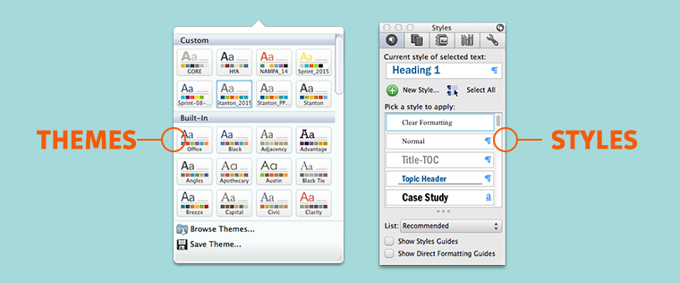
If you already have a brand-approved and tested template, make sure you are taking advantage of it. Use the Styles and Theme Colors pre-programmed into the template to eliminate any guesswork of what is brand-approved.
Don’t have a theme yet? Don’t worry we will cover that in Part 2: PowerPoint Ninja.
Once you have your template, the first step in styling your document is to “clean” the text of any outside formatting. Before you start applying text styles, make sure the content comes in without any formatting to eliminate confusion or design conflicts. To accomplish that you can do one of the following:
Step One: Paste Special
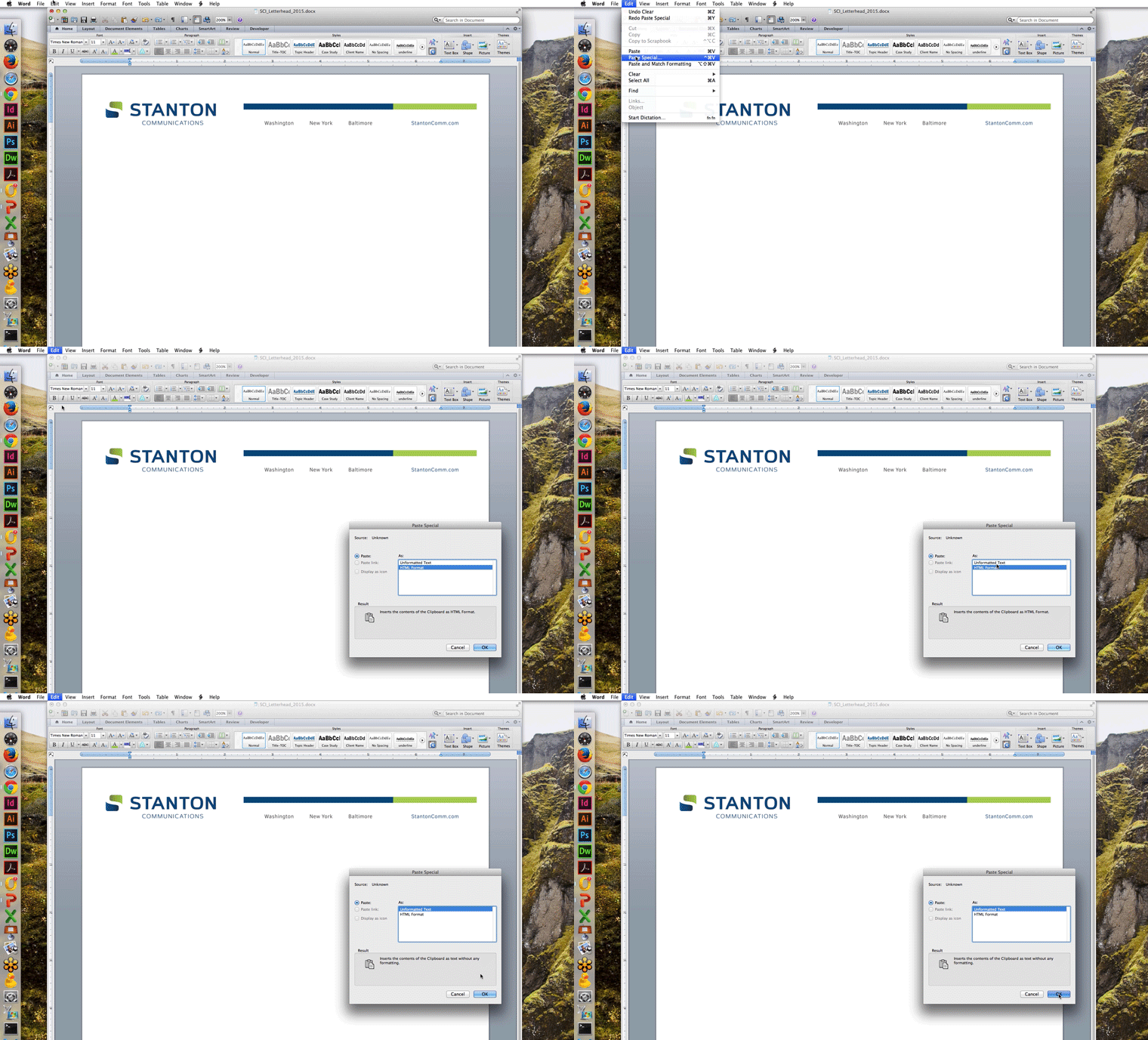
Paste Special allows you to scrub the text of any previous formatting and start fresh. Consistency is key in creating a successful document with clear hierarchy so be sure not to skip this step.
Edit > Paste Special > Unformatted Text
Shortcut Keys
Windows: [ Ctrl ] + [ Alt ] + [ V ]
Mac: [ Ctrl ] + [ Cmd ] + [ V ]
If you already have placed your text in the document without using paste special, click the clear formatting button ![]() in the Home toolbar to eliminate any outside formatting.
in the Home toolbar to eliminate any outside formatting.
Step Two: Choose Your Style
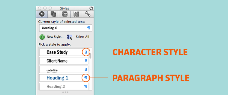
The structure of a document is paramount and will help viewers of your document better understand your vision. One way to help create a strong visual hierarchy is by using the preset Styles within your template. Below is a brief description of the different styles within Word and how they may be best utilized.
Character Versus Paragraph Styles
Character styles can be applied to individual characters whereas the paragraph style is applied to an entire paragraph.
Lists and Tables
Templates may also have pre-set formatting for bulleted and numbered lists as well as guidelines for creating tables.
Polishing the Document
If you follow AP style, there were some rule changes a while back. Notably, the change of Web site to website in 2010 and the much-needed farewell of the dreaded double space after a period. Other bonus point items include the removal of double-returns and looking after orphans and widows.
Yet another point of contention, the use of em-dashes, en-dashes and hyphens. A quick overview:
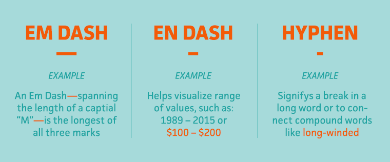
Em dash: The longest of the three marks, an em dash should be used within a sentence as break or pause. Can be presented with—or without—spaces on either side of the dash.
En dash: The second longest mark is the length of a capital “N”. The en-dash should be used when visualizing a “range of values, such as a span of time or numerical quantities” such as “Stanton Communications from 1989 – 2015.”
Hyphen: Shortest of all three, this punctuation mark should only be used to “divide words that break at the end of a line, or to connect parts of compound words.”
Whether you are revising double spaces or hyphens, it is important to polish your document and ensure it is consistent throughout. Below are a few tips to facilitate your formatting.
Step One: Find and Replace
To help you in your quest to remedy the wrongs of old, Find and Replace is ready for action.
Eradicate the Double-space
In the Find search bar, enter Space + Space then, in the Replace bar, enter Space and press Enter. If there are any double-spaces in the document, they will appear highlighted in yellow under Matches and you may chose to Replace All or Replace each instance one-by-one.
Follow the same process for checking on the proper use of em dashes, en dashes and hyphens. For instance:
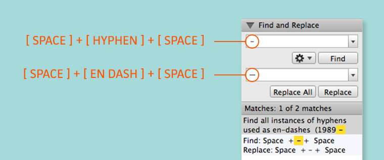
Find all instances of hyphens used as en-dashes (1989 ‐ 2015 >> 1989 – 2015)
Find: [ Space ] + [ ‐ ] + [ Space ]
Replace: [ Space] + [ – ] + [ Space ]
Step Two: Tracking and Kerning
![]()
At times you will have a word or two fall awkwardly onto the next line or the rag of a paragraph is distracting. You may fix this by slightly altering the tracking, which changes the space between all characters, or by kerning, which controls the spacing between individual characters.
Format > Character Spacing > Tracking
Format > Character Spacing > Kerning
Be careful not to track or kern too much in either direction or your text will look unnaturally wide or squished.
Step Three: Check up on your Non-Printing Characters
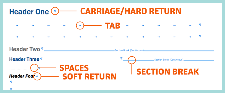
Know what a pilcrow is? You do now: 
Often called the paragraph mark, use this handy tool to identify where all your non-printing characters are; spaces, returns, page breaks, section breaks and tabs. Reviewing the non-printing characters will help you troubleshoot any gremlins in the document, errant section breaks or odd tabs.
There are several other tips that we didn’t cover, but feel free to leave comment if you have any questions or tips of your own. Also, be sure to check out Microsoft Office’s free training and tutorials if you are curious about learning other Office tips.
Watch out for next week’s post: Become a Microsoft Office Pro: PowerPoint Ninja.