
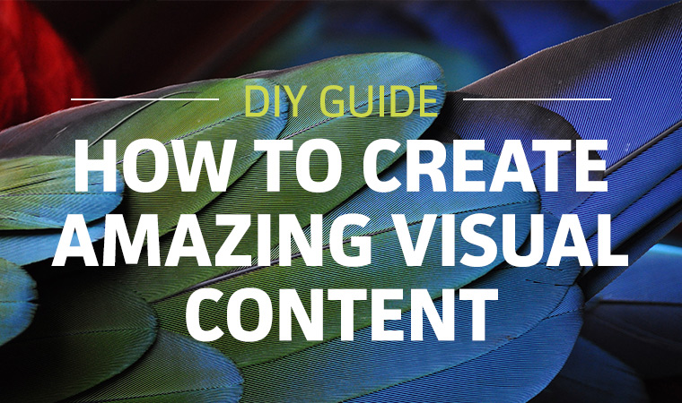
If you aren’t creating visual content for your brand, you should be.
In 2014, PR Newswire found that press releases sent in 2013 that included multimedia—logos, photos, infographics, video, microsite—increased visibility up to 5,092% over traditional text releases. Amazing, right?

What I found even more shocking was that 86% of press releases DID NOT include visual elements. We can do better as communicators and the great news? We have a myriad of tools at our disposal to help us easily create compelling visuals. You may already be fairly familiar with one of them, and it’s not Adobe Creative Cloud.
It’s PowerPoint. You probably have the basics down due to formatting a dozen business presentations, but do you know you can use PowerPoint to create infographics and social sharable images? Sure can.
Create a Custom Size PowerPoint
Open a blank PowerPoint template and go to File > Page Setup and change the dimensions to your desired size and click “OK.”

For example, if you are designing a mobile-friendly infographic, I suggest starting with a size of 600 pixels by 1200 pixels. PowerPoint will only allow you to enter in inches and centimeters, so in order to get an exact measurement equivalent, you will have to check your screen’s DPI and do some math. My screen displays at 96 px = 1″ so the correct size would be 6.25″ x 12.5″ for the canvas. As you are designing you may find you need to make the page longer, but a 1:2 ratio is usually a good place to start for infographics.
Design a Theme
Once you have your canvas set, create an interesting PowerPoint Theme—consisting of color and font selections—for your graphic.
COLOR
There is a lot of research as to why color is vital to your design, so don’t overlook it. Make sure you have a great palette that speaks to your audience and medium. It’s best to use a limited color palette, perhaps three to four colors total, but you may use tints and shades to add contrast and variety.
Color inspiration: Colourlovers.com
FONTS
You don’t have to stick with the standard fonts that come with PowerPoint—go on, live a little! By adding a unique font, you can create interest while elevating your brand. Be careful not to get too foolhardy with the fonts though. Just like colors, they are best used in a limited fashion. Try not to use more than two fonts in order to avoid confusion and distraction in your design.
Font resource: Font Squirrel
ICONS
We process visual information faster than text, and we retain it longer. Take advantage and use more iconography in place of text where appropriate.
Icon resource: Picol,
PHOTOGRAPHY
There are so many amazing, free, non-stock photography resources out there. Some of my favorites:
You can also search Flickr and filter by license. Just be sure to attribute it correctly.
Still don’t know where to start? Perhaps some design inspiration will help. Check out: Behance, Dribbble or other designer hangouts.
What if I don’t like PowerPoint?
I hear you, PowerPoint can be cumbersome to work in. Another great place to start and alternative to PowerPoint design is Canva. They have great built-in, dummy-free designs that are sure to make you look sharp on the web. Best of all, Canva is free! Plus, they have an amazing Design School blog chock full of great ideas, articles and how-tos.
There are tons of other services out there, both free and subscription based. Find your tool and get out there and design!

