
In this day and age, one thing has become clear: mobile is taking over Internet surfing. Research from the Pew Internet Project shows that the majority of adult cell phone owners use their devices to go online, and many access the Internet primarily using their cell phones rather than a desktop or a laptop computer. In fact, 2014 marks the first time mobile devices have surpassed PC Internet usage.
With the shift from desktop to mobile, the question for graphic and digital designers remains constant: how do you make a website that appeals across various platforms with different screen sizes?
The answer is Responsive Design. This approach enables websites to automatically adapt to the size and specifications of a visitor’s screen. Ideally a website created using Responsive Design works just as well on desktops as they do on mobile devices, providing an optimized user experience for every visitor.
With the help of animated GIFs from Fast Company and Froont, here are four points to help you better understand Responsive Design:
1. Flexibility
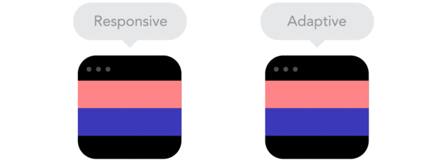
Responsive designs fluidly expand making the browser window intuitive. Designed to resize to the platform display, Responsive sites offer more flexibility than a one-size-fits-all approach of a static site or an adaptive site. Static sites are forever stuck in one layout, often making mobile use difficult. Adaptive sites use a set of general desktop, tablet and mobile sizes to adjust.
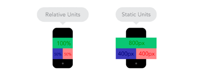
2. Relative Units
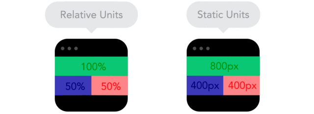
Responsive designs are set up in ratios rather than fixed units of size. For instance, instead of sizing your image at a static 300px wide, you would make it approximately 30% of the page. That allows the design to scale and fit proportionally keeping your website beautiful and easy to read across different screen sizes.
3. Breakpoints
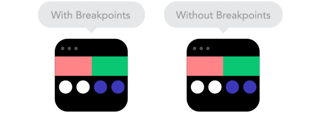
Breakpoints act as an instruction manual for assembling content blocks on the various platforms it may encounter. These predefined points determine how content will stack, providing a better user experience. The next time you swivel your smartphone and see a website layout morph from two columns to one, now you know breakpoints are most likely the reason.
4. Vectors
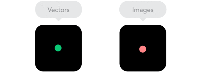
Using vector images is a good way to make sure that your graphics are going to look great on any size screen, because vector images are made up of scalable objects. These objects are defined by mathematical equations rather than pixels, so they always render at the highest quality.
As more and more people access the internet on devices with varying screen sizes, designers must consider building sites using Responsive Design to ensure the most uniform and optimal user experience.

