
QUICK PR READS YOU CAN TACKLE BETWEEN BITES
Happy Tuesday, Lunch Breakers!
Tis the season to admire the flowers that are in full bloom and to get started on your spring cleaning. And that can mean cleaning your home, your car or, in the marketing and public relations industries, your brand.
In this week’s edition, we’re taking a look at big brands that have made both successful and unsuccessful attempts at creating a new look for a fresh start this spring.
Assembling a New Ikea Logo
The team at Ikea spent two years attempting to assemble its new Fönster – and no, that’s not a new piece of Ikea furniture. Fönster, Swedish for “window,” is Ikea’s new “logo system,” implemented for online use in efforts to move towards a more robust digital portfolio.
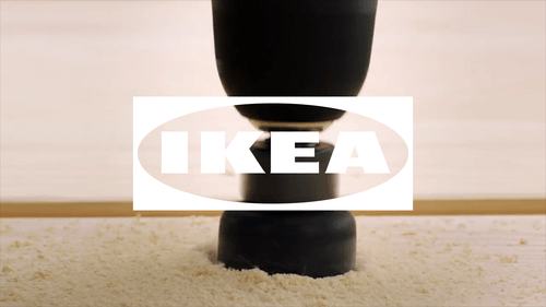
The new design is very similar to Ikea’s classic blue-and-yellow logo, but with a more simple, all-white take. This is a smart move that allows more creativity with online content while maintaining brand recognition. The logo is also able to sit on top of any image or video online, making it adaptable across platforms and easy on the eyes for consumers.
[bctt tweet=”The team at @Ikea spent two years attempting to assemble its new Fönster – and no, that’s not a new piece of Ikea furniture. ” username=”@stantoncomm”]
Facebook Goes Off-Kilter
As Facebook continues to roll out its redesigned mobile app, everyday users and designers have noticed that the social media giant’s mobile icon seems a bit off. Is this simply an optical illusion?
In previous iterations of the mobile app icon, we’re used to seeing the “f” slightly off-center and towards the right, whereas the new icon is centered. However, the weight of the new icon skews more heavily to the right side, with uneven slanting on the left side.
As usual, Facebook has bigger problems than an odd new mobile icon, especially with its co-founder calling to “break up Facebook.”
Sears’ New Look
Sears, the 126-year-old department store, has seen some troubling times recently. It filed for bankruptcy in October 2018 and has closed more than 3500 stores in the past 15 years. Last week, Sears unveiled a new logo and slogan – “making moments matter.”
Will a new slogan and logo revive Sears? Probably not. The new logo immediately drew criticism since it looks remarkably similar to Airbnb’s logo, which debuted in 2014. For many brands, a non-text logo can help protect their intellectual property and build positive brand recognition, but with Sears, it may not be enough to save the failing department store.
making moments matter.
The big, the little, and all of them in between. We’re here for yours,
building a home and life you ?. Home. Heart. @Sears. #iheartsears pic.twitter.com/P5jlT5cp8k— Sears (@Sears) May 1, 2019
Inspired Yet?
If all these logo updates have you inspired to take a look at your branding, check out this Forbes piece from Kailin Kassabov, founder of Protexting.com, for tips to brand on a budget. Consider networking, using social media and content marketing for price-conscious ways to up your branding game.

